
Why Paul Rand hates logos
 First published in Blueprint, September 1989
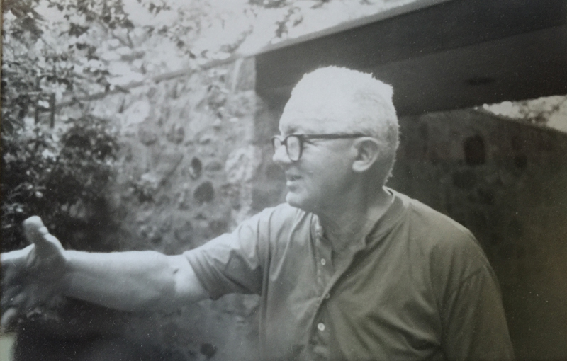
In the pantheon of US designers, they don’t come more eminent than Paul Rand. He made corporate identity into modernist clarity
‘The IBM corporate identity manual took many years. It was boring. You have to be Swiss to do that kind of stuff – I don’t have the patience or the ability. Elliot Noyes? That guy was a good politician with Tom Watson. He got me in to do a presentation in 1956, but that was all. Elliot, he had nothing to do with the work I did. Arthur Pulos and Stephen Bayley say he did, but that’s for the birds. Elliot used Charles Eames and me to critique his finished models, though. But I never asked him to critique my work. Never’.
Getting to interview Paul Rand is a succession of surprises. It’s he who answers the phone, in a Brooklyn Jewish accent thicker than chicken soup. He has no secretary; no computer, just a fax. Then, he turns out to be accessible at short notice, even though, at the age of 75, he’s snowed under with work: for IBM (still); for the Department of the Interior (commemorating the 200th anniversary of Benjamin Franklin’s death for the City of Philadelphia); and for Harvard (to mark the completion of a new building). Rand is prepared to talk, he says disarmingly, because that will get him out of having to attend to his clients.
Did he have much of a formal training? No. The scatological Brooklyn expletives run even faster than usual when Rand describes his brief sojourns at Pratt and Parsons: ‘We were led into a barn and tied. We copied Caslon. Raphael meant nothing. I can’t say I ever had a teacher, although I did learn from George Grosz in the early 1930s’. Naturally, Rand would present his major corporate identities to the Board? Not at all. ‘I don’t like public speaking – it’s like tasting hell. In front of senior executives, a good salesman can kill a good designer just by the power of his speech. That’s obvious, or the US wouldn’t have all the garbage it has on its billboards. Usually I send my stuff through the mail’. But surely Rand believes that good corporate identities sell? ‘Nonsense. The thing that sells, with or without a good identity, is a good product. The only reason for having a good identity is – why have a bad one?’.
Rand is heavy with frowns, criticism, gestures of the short, stubby hand. He is emphatic, loquacious. You get the feeling that, in business, he could be at least crabby, if not downright impossible. But he is also charming, highly energetic, a scholarly, prolific and lucid writer, a man who travels by Concorde but mows his own lawn. He designed his own wood, stone and glass house, a monument to modernism, nearly 40 years ago. In his time he has also done showrooms for IBM. He still teaches, extensively, at Yale, where he holds a professorship.
Pastel salads
Born of a poor family of Austrian immigrants, Rand found himself copying posters for Ivory and Palmolive soaps when he was 11, by which time his father had moved from working in the New York garment industry to running his own grocery shop. ‘I used to deck out my Pa’s store with crêpe paper, but he never liked it. My parents never paid much attention to anything I did in my career. It was probably for the best’. At the age of 15, Rand ran into advertisements for Austin Reed and Eno’s salts in a copy of the British magazine Commercial Art found in the art supplies department of Macy’s (that magazine hasn’t been equaled since’, he pronounces firmly). From that moment on he was hooked; after his brush with education, he joined the studio of George Switzer, a fine New York commercial artist who paid $15 a week and reimbursed his handful of designers for overtime with dinners delivered by a black maid. ‘Old designers pass on like generals’, Rand confides. ‘Switzer was good; so, in industrial design, was Gustav Jensen from Denmark and Joe Sinel, the Australian. But in graphics the best work came from the early Germans: Lucian Bernhard in posters; Wilhelm Deffke, who did the mark for Pelikan; the stamps and trademarks of Hadank; the marzipan packaging Alfred Mahlau did for Niederegger; the fashion drawings of Paul Scheurich. You don’t know these people? Today ignorance of history is true of teachers, not just of students. The head of the Bauhaus archives in Berlin – a man in his fifties who majored in philosophy – knows nothing of this.’
Rand’s books are studded with references to the Shakers, the Cubists, the Constructivists – and to Jan Tschichold. He reads widely in art history and other disciplines and is furious that other designers don’t. But in 1934, when he started his own, tiny studio in 38th Street, the big issue was to be able to squeeze under his drawing-board. Constricted by the Depression, Rand freelanced as art director for Glass Packer magazine, drew pastel renderings of salads and biscuits for the National Biscuit Corporation and stooped to lettering cartoon strips for Camel cigarettes. Then came a break: he became art director, first for Apparel Arts, then, at the tender age of 23, for Esquire.
‘As long as I’m not cheap’
There is a wonderful cover for Apparel Arts, of a photographed propeller with a dropped-in, illustrated fern; also, of anonymous men in top hats. But Rand exhibits none of his work for Esquire. It is his covers for Direction, in its day an even lower-budget Blueprint, that he favours most. They are spare, typographic, and adorned only by the gnarled, diminutive but idiosyncratic signature of his handwriting – a recurrent feature of his post‑war work. They also treat the key issues of the mid-century in a timely and must poignant manner: the rape of Czechoslovakia (November 1938), the irony of a barbed-wire Christmas (December 1940), the child hunger of the concentration camps (an astonishingly early Christmas 1943). Yet for all these themes, Rand abjures politics: ‘My parents were Democrats, but I’m profoundly boring outside design. If it looks terrific, then that’s all I care about’.
After the looks, and strictly of secondary importance, comes client approval; after that, the fee. ‘These big studios can do good work. Pentagram, for example. But they always have a big overhead. That’s why they have to charge $300,000 for a corporate identity, complete with fan dancers and balloons. For me, the fee is only important as long as I’m not cheap’.
From 1941 to 1954, when he was voted one of the 10 best art directors in the United States, Rand did, however, see fees and clients aplenty. With Bill Weintraub and David Smart, he helped form the William Weintraub Advertising Agency, kicking off with a whole floor, rent-free, above Radio City – for just the three of them. Out poured book covers for Knopf; ads for Dunhill, Airwick and Smith, Kline & French’s immortal Benzedrine; sweet vermouth labels for Dubonnet and gin labels for Schenley. It was a bizarre cocktail, but Rand describes Knopf as ‘perfect’ clients and is especially proud of his work for Dubonnet: ‘Cassandre liked it, because I was the only designer not to modify the rounded face of his Dubonnet man. He was brief, to the point. I didn’t like it when he switched to painting, but as far as his work in design went his ideas were great’.
It was in the Weintraub years that Rand perfected his technique of integrating photography so that it pokes out of powerful graphic symbols. For Jacqueline Cochran cosmetics, the Joseph Mankiewicz movie No Way Out (1950) and – much later, when he had long had his own studio – an annual report for Westinghouse Corporation, Rand montaged intriguing images behind bold strokes in a mutually reinforcing style.
Licking Madison Avenue
At about the same time he and his first wife, Ann, brought out a series of four children’s books (‘fillers’, he says, a little contemptuously), which set another important pattern: that of dropping in childlike, humorous and luscious pastels and primaries against backgrounds which are frequently black. I grew up with one of those books. The pinks and whites of the ice-creams in Sparkle and Spin suggested another world: though I didn’t know it, they were like licking Madison Avenue in a Manhattan summer. Rand re-used some of the basic imagery of Sparkle and Spin in an IBM Gallery poster in 1970. lt works; it still looks fine.
But what about the IBM logo, product of Rand’s shift from advertising to corporate identity? ‘I hate the word logo. l prefer trademark. The idea came from the rules they used to put beneath signatures on important documents so as to prevent forgery by erasure. I wanted to convey authority’. And the visual pun of the eye, the bee and the M, laid out on a black background? ‘I had the idea for that right away – as soon as I started to work for IBM. But it only came out in 1981, and then as a poster, a personal present that the company gave away to IBM designers. Eventually it got a wider circulation: they put it on the cover of Think! magazine. It took a long time for IBM to be able to handle a joke like that’.
Pulped by MOMA
It was through IBM that Rand met his second wife, Marion Swannie; she managed the company’s design programme, working with Rand, Eames and Noyes. After winning that contract, Rand went on to do some of America’s most famous corporate identities, including those for Cummins Engine and Westinghouse (1960), United Parcels Service (1961), and American Broadcasting Corporation (1962). Of these, I feel the first two stand up perfectly, but the others do not. The UPS symbol was taken over by Rand from an earlier design and he himself is not happy will it. As for ABC, it has, for me, a slightly dated aura.
After the JFK years, when corporate reorganisation was the leitmotif of the American visual landscape, Rand settled down to do packaging, posters and ads for Big Blue, Cummins and Westinghouse, augmenting these with book jackets and a series of posters for the American Institute of Graphic Arts. In nearly every case, the work is superb; but it is in a much more recent (1986) corporate identity that Rand has once again confirmed his central position in the graphics firmament.
The identity is for NeXT, the computers‑for‑education company established by Steve Jobs, once a cofounder of Apple. Jobs called Rand – ‘people always come to me; I wouldn’t know start selling’ – but Rand turned him down because of his continuing commitment to IBM. Undeterred, Jobs secured IBM’s assent. And then? ‘Jobs described the machine, not the company. He said he liked the Xerox logo, which I hate. Still, by the time we got back to the California hotel, I knew what to do. So I roughed it out there.’
‘Eventually he had me back to his minimalist house for dinner. Should I present before or after we’d eaten? I knew it was good, but if he didn’t like it before, the dinner could be difficult; if he didn’t like it after, he might throw up. I gave him me usual book, full of explanation – I knew he’d want a lot of that – after dinner. The more he read, the more he smiled. Then he got up at the end and said: “Could I hug you”?’
The NeXT identity is only now beginning to appear on machines around the United States. And in my eyes it is a triumph. As Rand points out, the lower-case e provides a rounded contrast to the straight capitals and improves readability; the two-by-two arrangement makes the most of a four-lettered word; the black cube, poised at an angle of 28 degrees, is jaunty and, it appears, pregnant with power and fun. Last, the vermillion N, yellow e, green X and cerise T spring out like stars in a night sky. AItogether, the design works as logo, seal, stamp, whatever. It is pure Paul Rand – a Rand fresh for the 1990s.
The man is a Royal Designer for Industry; he has the full panoply of medals and awards that the US graphics establishment could ever offer. But it hasn’t all been easy. New York City’s s Museum of Modern Art, a frequent client over the years, nevertheless pulped the Portrait of Picasso catalogues he designed for it: inexplicably, the management didn’t like the cover. Rand’s undisclosed new corporate identity for the Ford Motor Company received rapturous acclaim – except from Mr Ford, who rejected it out of hand.
Still, Rand has pulled off two personal coups. His wonderful photogram of an abacus, rejected by ee cummings (‘an egomaniac with illusions of being an artist’) for the poet’s one by one, became instead the cover for his own Thoughts on Design (1946) and even wound up being printed on fabric. Also, his design for Thomas Mann’s The Tables of the Law (Knopf, 1945) won him a congratulatory letter from the author.
Drawers of razors
In Rand’s house there are drawers full of razors by Dieter Rams. They are treated as art objects: ‘I have most of them’, Rand confesses, ‘even though most of them don’t work’. There are also works by Arp, Klee, Léger and Lissitzky, but Rand denies these masters are influences: their work is to be studied for its timeless principles of colour and proportion, but it is not to be imitated. Rand is impatient with definitions and distinctions, believing that those same artistic principles should inform every kind of graphics. He agrees that design is more a trade than a profession and would much rather discuss production quality and paper texture than postmodernism or New Wave graphics (the latter, he booms, uses complexity as camouflage; as for its love of computers, ‘that’s like glorifying a pencil’).
It was Moholy-Nagy who taught Rand his fondness for books: In a conversation, which Rand still celebrates for its succinctness, the Hungarian asked the American: ‘Do you read?’ Rand replied: ‘No’. Moholy-Nagy concluded: ‘Pity’. So which writers does Rand admire? Among many, he cites William James and John Dewey: the philosophers, in short, of North American pragmatism. And it is pragmatism, not ideology, that gives Rand’s work the deft lightness, rightness and grace it has had for more than half a century. So does he consider himself an American? ‘I’m not into golf,’ he replies, ‘or baseball. I feel European. One hundred per cent.’
Within that paradox lies all the genius of Rand. ‘People think that it’s the mark that sells the product. Crap! It’s merely the signature on the cheque – who the hell looks at that? You look at what the cheque is worth, not the signature’. This may be true. But with Rand, the signature itself becomes valuable. European theory, American practice: together, Rand and the corporation have truly brought art to the masses.
To open and download a PDF version of this interview click on this Why Paul Rand hates logos link. Photograph: James Woudhuysen.

@jameswoudhuysen I use my bicycle every day. Exercise and access to shopping without any parking meters and all that fuzz. But alfa-cyclists are the worst. They are competing at 40 mph and always acting rudely to get where they are going.
A PRO-CAR CYCLIST WRITES: 12-1pm tomorrow on #R4, will be talking bikes, cars, pedestrians, public transport – and #JeremyVine
Stimulating piece on the #CrisisOfCustomerService by clever @ClaerB @FT.
All that Clinton-era #CustomerExperience guff was always for the birds - certainly compared with, er, price.
The new thang? Often there is NO service - and thus no #CX!
Innovators I like

Robert Furchgott – discovered that nitric oxide transmits signals within the human body

Barry Marshall – showed that the bacterium Helicobacter pylori is the cause of most peptic ulcers, reversing decades of medical doctrine holding that ulcers were caused by stress, spicy foods, and too much acid

N Joseph Woodland – co-inventor of the barcode

Jocelyn Bell Burnell – she discovered the first radio pulsars

John Tyndall – the man who worked out why the sky was blue

Rosalind Franklin co-discovered the structure of DNA, with Crick and Watson
, a method of quantifying minute amounts of biological substances in the body")
Rosalyn Sussman Yallow – development of radioimmunoassay (RIA), a method of quantifying minute amounts of biological substances in the body

Jonas Salk – discovery and development of the first successful polio vaccine

John Waterlow – discovered that lack of body potassium causes altitude sickness. First experiment: on himself

Werner Forssmann – the first man to insert a catheter into a human heart: his own

Bruce Bayer – scientist with Kodak whose invention of a colour filter array enabled digital imaging sensors to capture colour

Yuri Gagarin – first man in space. My piece of fandom: http://www.spiked-online.com/newsite/article/10421

Sir Godfrey Hounsfield – inventor, with Robert Ledley, of the CAT scanner

Martin Cooper – inventor of the mobile phone

George Devol – 'father of robotics’ who helped to revolutionise carmaking

Eugene Polley – TV remote controls

Thomas Tuohy – Windscale manager who doused the flames of the 1957 fire
0 comments