
Straddling art and design: an interview with Milton Glaser
 First published in Design Week, 20 April 1990
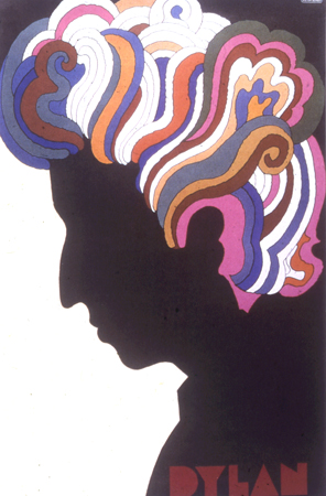
Milt Glaser put Bob Dylan in silhouette on a memorable poster (1967), and designed the red-hearted I Love NY logo (1975). Now the subject of a Sky Arts documentary, I talked to him 20 years ago
Few areas of design have been untouched by the creative hand of Milton Glaser in a career which has spanned graphic, interior and product design as well as illustration. James Woudhuysen assesses one of America’s most eclectic designers
Over 11 years, Milton Glaser designed 200 food supermarkets across America. Exteriors, interiors, signs, fixtures including a giant glass fibre pear, succulent and green, suspended off a store facade as a piece of community art, and no fewer than 2000 separate items of packaging. Name of the chain: Grand Union, since defunct in the welter of leveraged buyouts that has swept the US retail business. Client, in open‑necked blue short‑sleeved shirt: Jimmy Goldsmith.
Glaser had got to know Goldsmith when he redesigned Goldsmith’s L’Express. Goldsmith called him about Grand Union: Glaser said he knew a bit about food but not that much about supermarkets; Goldsmith said that a new model for supermarkets was what he wanted.
Says Glaser: “I had a sense of the dietary changes America was going through. Supermarkets, by contrast, tend to think margins or refrigeration. Also, I had a sense of the shopping experience. Through our work redesigning New York magazine, we learned how to get on the reader’s side”
He clarifies the link between supermarkets and magazines: “It’s always struck me that what the French call les magasins are similar to magazines. Both are collections of random elements.
“The problem is to get people to move from front to back, so they don’t just dot around. In a supermarket you have to change the space and the lighting, just like you alter the rhythm of a magazine. Above all, the lighting.”
At a sell-out lecture held at London’s Design Museum last month, Glaser said nothing of all this. Leaning towards etymology, he explained that lustrare – to shed light – is the root of the word “illustration”. He showed a wonderful, distinctively Russian kind of natural light in the cover he has illustrated for a book on Gogol, and gave a rich, scholarly, moving and succinct art historian’s account of light from the Renaissance to Impressionism.
From the mid‑1970s to the mid‑1980s, Glaser was chiefly engaged in rolling out a massive and terrifically commercial supermarket chain. Yet at the Design Museum, London, he told an admiring audience of the elasticity of oil paints, of frescoes, and of his preference for doing caricatures of people, not likenesses.
It is odd. In an interview, Glaser will tell you that he likes to draw, but does not consider himself an illustrator; that he is mostly interested in communicating ideas as a designer, even though he would still rather execute the final images himself. Yet at the lecture he did not dwell long on the umbrella‑shaped light fittings that he has designed, or on the ceiling and table lights he has done for Aurora, a restaurant. His main focus, rather, was illustration.
We see his excellent new set of book covers for the works of Hermann Hesse. We revel in the different styles of his poster portraits of Bach and Mozart, done for concerts at New York’s Lincoln Center. We are reminded that much of his work is inspired by music: by performances and records, whether classical or rock.
But we see nothing of the Glaser that is animated by food – nothing of Grand Union stores, or the ice cream cones he did for Sammontana Gelati All-Italiana of Tuscany. Nor is there time to touch on Sesame Place, two children’s education‑and-entertainment facilities in Pennsylvania and Texas which Glaser designed for Anheuser Busch.
Milton Glaser is indeed a learned and witty man. Born in 1929, of imposing height, he still teaches every Wednesday night in Room 202 of the School of Visual Arts in New York. He’s been doing that for 29 years, and arranges his European flights so he can get back in time.
And, both through Milton Glaser Inc and through WBMG, a group shared with his distinguished graphic design colleague Walter Bernard, Glaser still runs a sizeable consultancy operation. Altogether, he helps oversee 25 people – 10 fewer than he had at the height of Grand Union days, but a total which, he believes, is “still too large”.
The team has just redesigned La Vanguardia Barcelona, and there is still consultancy work with Time. Glaser is also working on a cultural daily newspaper for Paris. But he prefers to talk about the 20 or 30 drawings and paintings he’s been asked to do for the 500th anniversary celebrations of the death of one of his heroes, the Renaissance painter Piero della Francesca. He enthuses, too, about the design of the complete sets and costumes for the opera, Falstaff, which is due to open in New York in January 1992.
Which way does Glaser turn? In his lecture, he mounts a persuasive defence of design against the slings and arrows of fine art. Of his years with Seymour Chwast and Ed Sorel in Push Pin Studio, he observes: “The idea was always that you didn’t separate design from illustration.”
But Glaser’s touch, though its breezy, colourful approach is readily identifiable in the world of supermarkets or ice-cream cones, seems to me more assured in the world of illustration and of relatively pure forms of graphic design. At the Design Museum, his speech stuck to what he is best at.
It’s a sensible move, but, since the publication of his wonderful compendium Graphic design in 1973, we have little record of what Glaser has been doing for nearly 20 years. He says he wants to find the time to do another piece of paperback access, but for the moment most of us will have to make do with the Mahalia Jackson poster, the series of Shakespeare covers for Signet Classics, and the Dylan poster. The history of US graphics show which is shortly to open at the Design Museum, for instance, contains only two pieces in which Glaser had a hand.
The show has been controversial. Mildred “Mickey” Friedman, of the Walker Art Center, Minneapolis, selected 800 pieces. Michael Bierut, head of graphics at Vignelli Associates, describes the show as “what Mickey likes of what Mickey knows”.
Whatever the verdict, it is, as Glaser observes, peculiar that Push Pin, which in the 1960s and 1970s used to fill up nearly a third of every annual published by the American Institute of Graphic Arts, is barely represented in the show.
“I feel I’ve been edited out, Stalin-style,” says Glaser, amused. “Clearly, today’s ideology shapes the way we see history – but ain’t it always the way?”
In fact, Glaser remains a towering figure in American illustration, graphics and, yes, commercial design. He is up there with Paul Rand and Saul Bass. “I’m fundamentally against big corporate identity programmes,” he tells you, right after mentioning, rather absently, that he is doing a corporate identity programme for the Italian railways.
British graphic designers, and especially those graphics students who will lead the profession in the next century, could do with a lot more of Glaser’s philosophical disquisitions on the defects of Modernism in typography and elsewhere.
These disquisitions, unlike most, are erudite. They are also illustrated, if the verb may be forgiven, by practical examples that joyfully communicate a sense of the alternative.
“I don’t think strategically”, says Glaser. “Even though I’ve been approached by a big agency, I’ve always been out of the industrial charmed circle. I’ve always been an outsider.”

@jameswoudhuysen I use my bicycle every day. Exercise and access to shopping without any parking meters and all that fuzz. But alfa-cyclists are the worst. They are competing at 40 mph and always acting rudely to get where they are going.
A PRO-CAR CYCLIST WRITES: 12-1pm tomorrow on #R4, will be talking bikes, cars, pedestrians, public transport – and #JeremyVine
Stimulating piece on the #CrisisOfCustomerService by clever @ClaerB @FT.
All that Clinton-era #CustomerExperience guff was always for the birds - certainly compared with, er, price.
The new thang? Often there is NO service - and thus no #CX!
Innovators I like

Robert Furchgott – discovered that nitric oxide transmits signals within the human body

Barry Marshall – showed that the bacterium Helicobacter pylori is the cause of most peptic ulcers, reversing decades of medical doctrine holding that ulcers were caused by stress, spicy foods, and too much acid

N Joseph Woodland – co-inventor of the barcode

Jocelyn Bell Burnell – she discovered the first radio pulsars

John Tyndall – the man who worked out why the sky was blue

Rosalind Franklin co-discovered the structure of DNA, with Crick and Watson
, a method of quantifying minute amounts of biological substances in the body")
Rosalyn Sussman Yallow – development of radioimmunoassay (RIA), a method of quantifying minute amounts of biological substances in the body

Jonas Salk – discovery and development of the first successful polio vaccine

John Waterlow – discovered that lack of body potassium causes altitude sickness. First experiment: on himself

Werner Forssmann – the first man to insert a catheter into a human heart: his own

Bruce Bayer – scientist with Kodak whose invention of a colour filter array enabled digital imaging sensors to capture colour

Yuri Gagarin – first man in space. My piece of fandom: http://www.spiked-online.com/newsite/article/10421

Sir Godfrey Hounsfield – inventor, with Robert Ledley, of the CAT scanner

Martin Cooper – inventor of the mobile phone

George Devol – 'father of robotics’ who helped to revolutionise carmaking

Thomas Tuohy – Windscale manager who doused the flames of the 1957 fire

Eugene Polley – TV remote controls
0 comments