
Sgt Pepper and all that
 Published as ‘Design and decline’, New Society, 29 May 1987
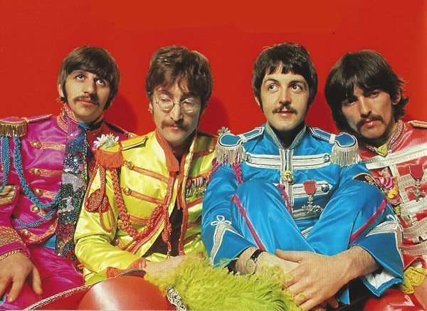
Sgt Pepper’s Lonely Hearts Club Band, released in May 1967, was part of an explosion in international visual awareness. What are the lessons of the design boom of the 1960s?
In Britain, in 1987, everybody has celebrated the Beatles’ pioneering concept-album-that wasn’t, Sgt Pepper’s Lonely Hearts Club Band: its music, Peter Blake’s record sleeve montage, the nostalgic military uniforms, the moustaches, drugs and so on. There is an expensive Granada TV documentary, It was twenty years ago today, and a well-researched if breathless paperback of the same title (by Derek Taylor; Bantam). In each account, the same joyous mementoes are hauled out. Abbey Road, George Martin, the sound experiments that led to all the later advances in multi-track recording studio technology. The two-sidedness of Beatles singles – Penny Lane/Strawberry Fields. The connection with San Francisco and the West Coast: with the Byrds, the Jefferson Airplane and the Grateful Dead. The connection with Amsterdam: the anarchistic Provos and their free white bicycles, the Vondelpark before the American tourists came, and the Beatles’ zany graphic designer threesome, The Fool.
It is all there and we have rehearsed it quite a lot over two decades. The Crazy World of Arthur Brown, whose leader set light to his hair in epic performances of Fire; the shaking of heads to the music; the painted Rolls Royce; Ken Kesey, Tim Leary, Allen Ginsberg, the Maharishi; the police busts, inspired by the News of the World, leading to Mick Jagger in handcuffs. But behind the more obvious paraphernalia of the 1960s, the design of the era has aspects to it which are somehow more relevant to where design is going today than are stroboscopes, light shows, bells and tight-hipped velvet trousers.
The current boom in British and international design – in public awareness of it, in government support for it, in the growth of the design business itself – brings us to our first paradox. Despite a Labour government, British design in the 1960s was very much less institutionalised than it is now. The Design Council operated out of Piccadilly, but in the epoch of George Brown’s National Plan, managed to stay out on a limb. Design consultancies were small, fragmented and, in the case of Terence Conran’s firm, prone to announcing redundancies on Friday nights. Design was not really part of Wilson’s revolution, which, in rhetoric at least, was to do with science and technology.
Yet sixties design was so good that it raises immediately another paradox: that the 1970s represented merely a blip in the evolution of post-war design. Who can remember the design of the 1970s? In the boom of 1964-74 design was on fast forward; in today’s recession, on fast rewind. But in the Social Contract years of 1974-79, design was on pause.
A few years ago, when he was the luckless leader of the Department of Industry, Norman Tebbit took to a Design Council press launch to declare his enthusiasm for design: good design, he announced, was design that made a profit. But Tebbit, who is well known for his argument that 1960s culture is to blame for Britain’s current ills, had better know the truth. Without the ‘permissiveness’ of 1960s design, Britain would today be without the spruced-up shops that fuel Chancellor Nigel Lawson’s consumer boom. It would not be able to substitute its own cars for Japanese imports, or to improve its trade balance on invisibles through the sale of British design services abroad.
British design was sad in the corporatist years running up to Tebbit’s hated Winter of Discontent (1978/9). It took all that time for the people whose eyes had opened in the 1960s to gain the positions they now enjoy: not only as designers, but above all as design clients. But what was it that opened their eyes? Given that Beatles culture was essentially Anglo-American, three Anglo-American media for design immediately appear significant:
1. LP covers These were an entirely new large-format graphic medium. LPs were what you walked around with under your arm, secret but badge-like, when you were going over to a friend’s house to listen to music. LP covers were packed with information about which black Chicago bluesmen had teamed up with which white Californian freak on an underrated track. LP covers were what you rolled joints on.
CBS did excellent LP covers, and published ‘The inner sleeve’ – notes about its fine rock stable. CBS brought out the tinted montage of Taj Mahal and Dr Byrds & Mr Hyde, and the multiscreen live colour shots and back-cover grainy studio monochromes of Mike Bloomfield, Al Kooper and Steve Stills (Super session). CBS’s Bob Dylan, not content with giving us more than 20 minutes of music on each side of his albums, came in wonderful covers too.
To riffle through a WH Smith record stack in the 1960s was to receive, subliminally or consciously, graphics news from all over the world. The trail to India made Jimi Hendrix’s second Polydor album, the double-sleeved Axis Bold As Love, feature psychedelic Indian elephants. Quicksilver Messenger Service’s Happy Trails gave an engaging pastiche of the art of the nineteenth-century Wild West. The Steve Miller Band brought the latest West Coast typography – globular-chemical, reversed out and unintelligible – to Children of the future.
Much of the photography was artfully out of focus; but it was nevertheless superior to today’s mainstream. Roger Daltrey wasn’t carrying an American Express card, just sitting in a bathtub full of Heinz baked beans. But photography was not all. The orange montage on Fresh Cream was perfect for waving under the red Woolworth lightbulbs used at parties. Procol Harum affected Aubrey Beardsley, people searched for Ringo on the cover of John Wesley Harding, there were send-up record covers about other record covers.
2. Magazines The excellence of record covers, their working as a kind of visual passport to other worlds, stood in marked contrast to much of the magazine design of the period. Melody Maker, for example, was read avidly, but had an old-fashioned graphic format. To look at Woman and its ads for Marmite, PG Tips, Carnation milk or Rimmel cosmetics is to see how much of the mass-circulation magazine design of the 1960s was based firmly not just on the 1950s, but arguably on the pre-war period. For every Oz and International Times, there was the graphic equivalent of Frankie Vaughan, Des O’Connor and the Seekers.
However the glossies, blamed by Hugh Gaitskell in 1959 for his election defeat, were now in the ascendant. Aided by boomtime budgets, the Sunday Times Magazine was a treat; but a glance back at its glossy rivals on the Observer and Telegraph shows how fertile the inauguration of the British colour supplement was. Environmentalist black-and-white photography from Wates, the builders, jostled with visual jokes from the brewers: surprisingly, the tone in both was leftish. Ads for the new synthetic materials were everywhere: Terylene, Courtelle, Wool, Dormeuil cloth (complete with Verushka and talk about ‘sybarites’), British Steel disco floors, ICI paints, and rainbow-hued radiators made by Allied Ironfounders.
A lot of the colour printing was done in Holland. In advertisements, greens and blues were popular (Pilkington glass, women workers at Wills tobacco, Consulate menthol cigarettes); but the overwhelming colours were light pink, as then used in lipstick, mixed with gold. The size and typographical quality of magazines was wonderful. Rolling Stone was almost three-dimensional to open up, and delightfully authoritative in layout and presentation. Nova made every elegant, big, black, Bibaesque headline a caption to pages as big and shiny as a cinema screen. In the early issues of Private Eye the covers, the restaurant ads and the Ralph Steadman and Gerald Scarfe cartoons all radiated fun.
3. Posters and corporate identity Since television had destroyed the commercial poster after the war, it was remarkable that, at just the moment when colour television and stereo music spread outward from America, the poster began an international revival. In San Francisco Stanley ‘Mouse’ Miller and his partner Alton Kelly designed for rock concerts held at the Avalon and Fillmore concert halls. Poster designers Rick Griffin and Victor Moscoso were renowned for their compressed floral type and psychedelic work. It is important to realise, however, that the use of psychedelia was not confined to the rock milieu. The Rockefeller for President Committee used the seminal combination of orange flared-trouser letters on a purple background in Nelson Rockefeller’s campaign for the Republican presidential nomination. John Lindsay used the veteran freak designer Peter Max for his campaign to be mayor of New York in 1969.
There was also a revival of the poster of the international left, even if output from the Cultural Revolution in China struck a gaudy note. From Latin America, and especially Cuba, came exotic, precise, not strident propaganda. France’s students showed bold black-and-white ingenuity at the press.
Perhaps the most telling symptom, however, that the 1960s were not what they seemed was the development of corporate identity design. Ever since the late 1950s, Britain, alongside most of the West, experienced declining rates of return on capital. Britain, closely followed by America, thus found itself leading the world in company mergers, rationalisations and nationalisations. One result was symbols for BEA, the Post Office Giro and Blue Circle (FHK Henrion). Another was housestyle and signage for motorways and British Rail (Design Research Unit, Jock Kinneir). In America, Anspach Grossman Portugal immortalised Citibank with an abstract, punctured cusion device; Don Ervin made a rounded logo for Conoco, a waterfall T for Transamerica and a hawkish eagle for the National Bank of America. Raymond Loewy’s outfit did everything: New Man in shirts, Fanta and Corona in soft drinks and Alcan in aluminium. Saul Bass tidied up Warner Brothers and Rockwell International.
Software design in the broadest sense
It was in Britain and America, Second World War victors, that corporate identity – the graphics of business upheaval – became prominent. Italy, Japan and West Germany, by contrast, didn’t have this problem. They were too busy reasserting national identities interrupted by mid-century blight to worry much about corporate identities. They were moving from reconstruction to consumerism at just the time that Britain and America, despite economic growth, were moving from consumerism to de-industrialisation.
What, in the 1960s, opened the eyes of today’s design-conscious British manager was innovative graphic design: a design which, though as dynamic as the 1960s, in reality denoted manufacturing decay and the rise of the service sector. In the world of products there was inspiration to be had from the Italians: from the furniture of Cassina, Castelli, Tecno, Kartell, the lights of Artemide, the Alfa Romeos of Giorgio Giugario, Olivetti office gear by Nizzoli, Sottsass and Bellini. But, apart from the coffeebar and the Spaghetti Western, Italian design was for the rich and cosmopolitan alone. As far as mass awareness of indigenous design went, Esso’s tiger in your tank, BP’s travel kits for families and the saucy nozzle-toting women in the ads for Regent petrol weighed heavier than the Jaguar E-type or the Lotus; certainly more than the Triumph Herald, the Triumph Vitesse or the Hillman Minx.
Only since 1974 has Britain really had an education in product design, courtesy of the Italians (white goods), the Germans (power tools, capital goods) and the Japanese (consumer electronics). For Britain and America it was graphics, cousin to fashion and fine art, that had the dominating position in the 1960s. It was not just American-Indian, Victorian and Baroque motifs, seminal Paisley swirls, Allen Cohen’s rainbow-printed San Francisco Oracle, or the Kings Road shop Granny Takes A Trip that captured the youthful internationalism of the day. There were unsung motifs too: the brash cigarette packs of Number Six and Guards, the bright stationery of WH Smith and the confident labels of Hartley’s New Jam.
Architects and the academically inclined had a general obsession with systems design, exhibitions, computers and methodologies. There was work for British industrial designers in packaging, executive toys, capital goods, scientific instruments and audio kit made in Cambridge. Kenneth Grange, working in Hampstead, designed worthy food mixers for Kenwood, Robin Day created chairs for Hille, and even the washing machines of John Bloom did functional service. But Britain was left with no substantial cadre of professional product champions. For every Habitat retail success, there was a G-Plan supply failure.
It was a similar tale in Britain’s burgeoning public sector. Apart from some reasonable brickwork in universities, and the exhaustively researched NHS hospital bed, streets could boast little civic pride. Dole and social security offices, much frequented after 1966, remained dismal. High-tech government projects – Tracked Hovercraft, the Advanced Passenger Train, Rolls Royce’s RB.211 aero-engine, the Steam Generating Heavy Water Reactor, the Supersonic Transport plane in America – collapsed.
In the 1960s, a revolt in images against the seamy, mediocre world of mass merchandise and public spaces seemed like a freak-out. But in fact to freak out was really to conform. That was quite clear from management literature, had people bothered to stand back from it all. While juggernaut technological enterprises became the focus of attention in the classic mid-1960s works of John Kenneth Galbraith, other, earlier writers served as hints that the old world of manufacturing was losing momentum: C Northcote Parkinson, Britain’s pessimist of paperwork (1958), and Theodore Levitt, founder of marketing in the Harvard Business Review (1960). For Anglo-Americans, hardware design was rarely a source of inspiration. The 1960s was when software design, in the broadest sense, reigned supreme.
There was one other factor around to stimulate design sensibilities, and it was not really a graphic one:
4. The space race. Rockets, capsules, telemetry, orbits and landings were all a measurable, objective part of the achievement of design. The images were astonishing and, like the graphics of the time, hopeful, international. Gagarin was a hero; the Mercury capsule, which I visited as a child in London, drew crushing crowds. Doctor Who fitted perfectly.
The lessons of 1960s design in 1987
First, a design boom does not necessarily imply a real economic boom.
Second, though LPs are no fun anymore, the art editors of today’s magazines enjoy mixed fortunes. Meanwhile, the poster and outer space can still capture our imagination. Last, the current bout of merger mania has made corporate identity all the rage again.
Third, Britain has added the implementation of good retail design, and the export of good industrial design services, to its basic capability in graphics. But the consistent application of good industrial design to British manufacturers, or of good environmental design to the public sector: these things, as in the 1960s, remain elusive.
In Britain today, the imagery gets better and better. But gas fires and post offices – these have stayed much the same.

@jameswoudhuysen I use my bicycle every day. Exercise and access to shopping without any parking meters and all that fuzz. But alfa-cyclists are the worst. They are competing at 40 mph and always acting rudely to get where they are going.
A PRO-CAR CYCLIST WRITES: 12-1pm tomorrow on #R4, will be talking bikes, cars, pedestrians, public transport – and #JeremyVine
Stimulating piece on the #CrisisOfCustomerService by clever @ClaerB @FT.
All that Clinton-era #CustomerExperience guff was always for the birds - certainly compared with, er, price.
The new thang? Often there is NO service - and thus no #CX!
Innovators I like

Robert Furchgott – discovered that nitric oxide transmits signals within the human body

Barry Marshall – showed that the bacterium Helicobacter pylori is the cause of most peptic ulcers, reversing decades of medical doctrine holding that ulcers were caused by stress, spicy foods, and too much acid

N Joseph Woodland – co-inventor of the barcode

Jocelyn Bell Burnell – she discovered the first radio pulsars

John Tyndall – the man who worked out why the sky was blue

Rosalind Franklin co-discovered the structure of DNA, with Crick and Watson
, a method of quantifying minute amounts of biological substances in the body")
Rosalyn Sussman Yallow – development of radioimmunoassay (RIA), a method of quantifying minute amounts of biological substances in the body

Jonas Salk – discovery and development of the first successful polio vaccine

John Waterlow – discovered that lack of body potassium causes altitude sickness. First experiment: on himself

Werner Forssmann – the first man to insert a catheter into a human heart: his own

Bruce Bayer – scientist with Kodak whose invention of a colour filter array enabled digital imaging sensors to capture colour

Yuri Gagarin – first man in space. My piece of fandom: http://www.spiked-online.com/newsite/article/10421

Sir Godfrey Hounsfield – inventor, with Robert Ledley, of the CAT scanner

Martin Cooper – inventor of the mobile phone

George Devol – 'father of robotics’ who helped to revolutionise carmaking

Thomas Tuohy – Windscale manager who doused the flames of the 1957 fire

Eugene Polley – TV remote controls
0 comments