
Saul Bass – film titles, films and corporate identity
 First published in Design Week, September 1989
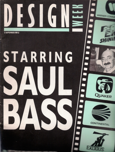
Workaholic, perfectionist and Hollywood raconteur: you name it, Saul Bass did it
Saul Bass (1920–96) was one of America’s very top post-war graphic designers. Seven years before he died, I talked to him on a Saturday morning in his studio on Sunset Boulevard. Truncated photo of the master: James Woudhuysen.
When rebellious Italian students closed down the Milan industrial design Biennale on ‘Quantification and urban life’ in 1968, they left the Saul Bass exhibit intact. They put his maze of 6000 stacked filing cabinet drawers to use, admired the trays full of mannequins, flowers and butterflies, and played his Oscar-winning short film for Kaiser Aluminum, Why Man Creates (1968), again and again.
Another Bass story throws light upon his collaboration with film director Alfred Hitchcock on Psycho. Bass designed and shot more than just the schizophrenic opening titles and the infamous shower sequence: he matted in the accelerated, time-lapsed clouds behind the hill-top Bates house, as well as storyboarding all – and filming part – of the gruesome stairway death of Martin Balsam.
Saul Bass is full of such anecdotes. ‘I’m going to give you long answers – a lot of it is fluff,’ he says.
But he does not really want to talk about the past. Of those post-war years, when independent producers were just starting to supplant the Hollywood studio system, he says: ‘I feel like I’m speaking about a different man’.
Bass would rather expand on the film he and his wife Elaine are working on for Matsushita, or the ‘retail architecture’ his 30-strong graphics consultancy is designing for Exxon and for Gulf, BP’s US subsidiary.
‘Maybe,’ he says, a moment of wistfulness interrupting the beady look he gives you when you ask about his history or criticise a detail of his work, ‘maybe I’ve still got two filling stations left in me’.
Seventy years old next year, Bass is, as he stresses, ‘one of the last practising designer-owners’. He’s had offers for his Los Angeles business, but has turned them down. And though he knows all the intricacies of leveraged buyouts, and wishes British purchasers of US design firms well (‘that way US designers can get rich at last!’), he regrets the loss of entrepreneurial values to a new layer of cautious, accountable managers.
‘I’ve no special criticism of large consultancies’, Bass murmurs. ‘Everybody makes self-serving arguments about size. The critical thing is leadership. What the client pays for is passionate, slightly mad commitment – the willingness to say ‘we’re not satisfied, even though we’ve chewed up the budget’. Also, leadership means staff contact: watching people grow. Especially young people, because they make the biggest leaps’, he says.
With his younger, marketing-trained partner, Herb Yager, Bass has begun to prepare a second generation of senior consultants at the Sunset Boulevard premises of Bass/Yager & Associates. He does not object to the firm mushrooming, and points out that it can grow to 100 people when design contracts are booming and when he needs his repertory group of 60 film people to make a movie.
For the moment, though, a lot of client work still falls on his shoulders. Around his desk are Aztec and Inca sculptures, African carvings, and his own current sketches and fine illustrations. On the wall behind him is a reversible card hung from a drawing‑pin: it concerns clients. On the front is the legend: ‘They need us more than we need them’. On the back, the message is ‘We need them more than they need us’. Bass flips the card quite often, and no, he cannot dine too late this Saturday night because he has a lot of work to do.
His father was a furrier from Odessa who drew and made paper cut-outs of birds and flowers; his uncle engraved tombstones in Tsarist Russia. Bass grew up in the Bronx and, like his admired contemporary, Paul Rand, took a deep draught of Modernist painting at the Art Students League in prewar Manhattan.
Next, he became a $10-a-week dogsbody at a label design house, decided to be a commercial artist, and was fired for demanding a $2 rise. He went to work in advertising and design firms doing graphics for Warner Brothers and Fox, only to move to the West Coast after the Second World War. Then, after backing the Hollywood Ten’s campaign against McCarthyism in the film industry, Bass did something that had never been done before: he invented the modern film title.
The movie was Carmen Jones (1954), and Bass’s innovation was to carry through his poster’s spiky typography and line‑drawn rose into the opening seconds of Otto Preminger’s drama. After that, the two men began a collaboration that climaxed in the front and back views of Preminger’s bald pate with which Bass adorned the moviemaker’s autobiography more than 20 years later.
In the meantime, Bass designed a Cubist poster and title for Billy Wilder’s The Seven Year Itch (1955), and in the same year caused a sensation with his campaign for Preminger’s The Man with the Golden Arm. When the film opened on Broadway, only the heroin addict anti-hero’s fractured limb was displayed outside the cinema. Frank Sinatra and Kim Novak received no mention. It was a triumph of graphic design over film stars. And, inside the theatre, the opening, jagged, reversed-out strips of light that formed the junkie’s lifeline showed that Bass, turning independent that same year, had truly arrived.
‘Before then,’ he says, ‘movie campaigns were all “SEE the priestess boiling in the cauldron! SEE the virgins in the temple”, and so on. Then, when Otto and I got the one idea, the industry was aghast. From there, it was easy to make the transition to corporate identity work.’
However, many Bass titles are much richer than the films they serve. To see the brilliantly faked catfight of Walk on the Wild Side (1962), the economy of the 1919-39 preface to The Victors (1963), the mysterious Indian clocks of Nine Hours to Rama (1963), and the nerve-wracking, split-screen cylinders fronting Grand Prix (1966) – to see all these is to recognise a visual master.
Significantly, though, Bass substituted graphics for montage when treating really great films: he put Lissajous figures on turntables for Vertigo (1958), sprayed the UN building with diagonals in North by Northwest (1959), and covered walls with graffiti in West Side Story (1961).
The short films he and Elaine Bass have made are also notable. Why Man Creates fully deserved the reception it got from the Italian students; and Quest (1983), despite being occasionally too biblical and smacking a little of George Lucas, has a dreamlike quality – made all the more remarkable by the fact that its bizarre special effects were achieved on a shoestring and without computer graphics.
For his titles, shorts and film posters alone, Bass would fairly stroll into the designers’ pantheon. But when you add to this his corporate identities from the 1960s onwards, Bass emerges as a bigger influence on the American retina than even Rand or Raymond Loewy.
Quoting Loewy, Bass says that corporate identity clients ‘came in over the transom’. The biggest, AT&T – he has actually done twice: once, when 23 regional Bell System telephone companies and 177,000 delivery vehicles cried out for a unified modernisation of the faded image of Ma Bell; and, again, when AT&T was divested of its regional operating companies by the Reagan administration.
The AT&T that remained had changed its role from a national phone company to a global telecommunications company. To convey the move, Bass turned his old, black, bell-shaped identity into a blue, lined globe – retaining the capitalised typography underneath, but arranging things so the sphere could easily be computer-generated for TV commercials.
This awareness of the 3D side of corporate identity projects comes naturally to a film director. But to my eye, its results with other clients – Hanna-Barbera, General Foods, and Japanese food-maker and distributor Kibun – are not as impressive as the AT&T work.
It could also be argued that some Bass identities are too similar. That for Minolta reminds one of the new AT&T. The squiggles for Celanese in chemicals and Lawry’s in food seasonings, like the faces for Paul Harris Stores and America’s Girl Scouts, appear to be twins.
Bass’s constant juxtapositions of symbol with name underneath, plus the frequent recourse to California rainbows, also lay him open to charges of repetition.
But his defence is cast-iron: ‘Nobody can own a curlicue, a profile or a colour by themselves and if I’ve gone for symbols placed above words, it’s been because this has been the most appropriate solution in the circumstances’.
‘Before 1957 or 1958, when corporate identity was merely house-style or image, you could use pictures of corporate headquarters. Then, as companies diversified, there was a move to abstractions, or monograms like IBM. That was OK. Identities were succinct and, provided they were accompanied by big promotional bucks, they could establish unique associations in the popular mind. But as the abstractions multiplied, they had to shout to be heard,” he says.
Bass continues: ‘Some companies carried on using words, which were more direct. But even then they had to pay the price of old‑fashioned typography, plus generic shapes around those words. Look at the ovals used by Ford, or by Du Pont.
‘For ourselves’, he says, ‘we think the big challenge in identity is to present both emotion and stability, trust, quality, accessibility. That’s why the loopy-symbol-and-simple-word combination works so well – even if reading it is a two-stage process.’
Bass may have a point. Certainly, his firm’s work for Continental and United Airlines both inspires and reassures, while his 20‑year old identities for Security Pacific, Rockwell International, Dixie Cups and Quaker all wear well.
Is the electronic TV-screen W for Warner an improvement on the WB shield, of Tweety-Pie fame? The answer would have to be ‘no’ in terms of nostalgia, but ‘yes’ when it is recalled that, even before its recent merger with Time, Warner has long been in the communications business – not just in movies.
Bass still presses on, reducing complexity, adding back some ambiguity (‘to avoid boredom’) and, in Hollywood style, escalating risk. He reminisces fondly about Hitchcock, mentions Orson Welles and Preston Sturges, enthuses about the blackness of Polish posters and the primitive quality of modern Russian design – and even puts in a word for Pentagram.
Viewing today’s graphic Esperanto, Bass prefers, so he says, national design characteristics: ‘aberrational’ Italians, ‘idiosyncratic’ Scandinavians, ‘translucent’ Japanese. Even now, he has submitted some suitably respectful designs to an ultra-traditional English client.
Yet, paradoxically, it is his monolithic worldwide programme for Exxon that finds Bass at his most loquacious. ‘We won the job against Anspach Grossman & Portugal, Landor, Pentagram and a hundred other consultancies. Literally. Exxon told us we won because, with no experience in the field, we were quite open about not having the answers; also, because we promised to put me and Herb Yager directly on the job.
‘To do it all, we had to clean up Loewy’s logo and build a massive databank of available materials over nine months – how to get hold of aluminium in Thailand and all that. But when it came out, the identity was crisp enough to become one of Time’s ten best designs of the year,’ he enthuses.
Bass is proud of his Exxon project, and rightly so. But, as he always observes, life at the top isn’t getting any easier: ‘Clients say “That’s terrific! But only terrific”’. Yet, with any luck, the man may give a whole lot more than two filling stations left in him.
To open and download a PDF of this FULL article, click on this Saul Bass, Design Week link.

@jameswoudhuysen I use my bicycle every day. Exercise and access to shopping without any parking meters and all that fuzz. But alfa-cyclists are the worst. They are competing at 40 mph and always acting rudely to get where they are going.
A PRO-CAR CYCLIST WRITES: 12-1pm tomorrow on #R4, will be talking bikes, cars, pedestrians, public transport – and #JeremyVine
Stimulating piece on the #CrisisOfCustomerService by clever @ClaerB @FT.
All that Clinton-era #CustomerExperience guff was always for the birds - certainly compared with, er, price.
The new thang? Often there is NO service - and thus no #CX!
Innovators I like

Robert Furchgott – discovered that nitric oxide transmits signals within the human body

Barry Marshall – showed that the bacterium Helicobacter pylori is the cause of most peptic ulcers, reversing decades of medical doctrine holding that ulcers were caused by stress, spicy foods, and too much acid

N Joseph Woodland – co-inventor of the barcode

Jocelyn Bell Burnell – she discovered the first radio pulsars

John Tyndall – the man who worked out why the sky was blue

Rosalind Franklin co-discovered the structure of DNA, with Crick and Watson
, a method of quantifying minute amounts of biological substances in the body")
Rosalyn Sussman Yallow – development of radioimmunoassay (RIA), a method of quantifying minute amounts of biological substances in the body

Jonas Salk – discovery and development of the first successful polio vaccine

John Waterlow – discovered that lack of body potassium causes altitude sickness. First experiment: on himself

Werner Forssmann – the first man to insert a catheter into a human heart: his own

Bruce Bayer – scientist with Kodak whose invention of a colour filter array enabled digital imaging sensors to capture colour

Yuri Gagarin – first man in space. My piece of fandom: http://www.spiked-online.com/newsite/article/10421

Sir Godfrey Hounsfield – inventor, with Robert Ledley, of the CAT scanner

Martin Cooper – inventor of the mobile phone

George Devol – 'father of robotics’ who helped to revolutionise carmaking

Thomas Tuohy – Windscale manager who doused the flames of the 1957 fire

Eugene Polley – TV remote controls
0 comments