
Fragile days of revolution
 First published in Design Week, July 1990
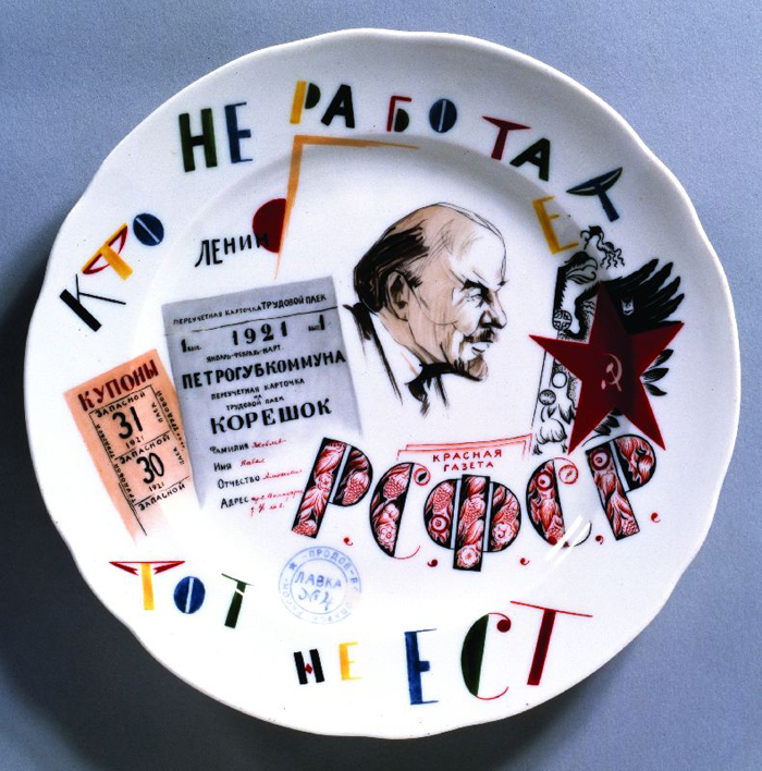
As a centenary show at the Royal Academy of Art revives British interest in the design output of Russia after 1917, this review of Nina Lobanov‑Rostovsky, Revolutionary ceramics: Soviet porcelain 1917‑1927 (Studio Vista, 1990) highlights the contribution made by potters
What a book. There is almost too much richness here. Since ‘Art into Production’, Britain’s seminal 1985 exhibition of Soviet textiles and ceramics, we have known about the transcendent plates of Sergei Chekhonin and his collaborators at the State Porcelain Factory, Leningrad. Here he stands revealed as one of the twentieth century’s masters of graphics. He is in the top five, maybe the top three. Still no full biography of him exists.
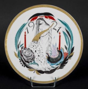
Sergei Chekhonin, Sorrow, 1921
Chekhonin recruited a series of brilliant artists, the majority of them women, to publicise the Russian Revolution and earn precious foreign exchange. The desperate shortage of food during War Communism (1919-21) meant that many of the designs were made to raise money for the starving; an equal lack of fuel meant that many, too, were executed in gloves.
You would not have guessed it. The delicacy of type, colour and layout is enough to make one weep. Chekhonin deftly combines folk art with Cubism, and, in a long plate full of the signatures of his Bolshevik heroes, carefully leaves out Stalin and his foolish ally in the realm of theory, Bukharin. Then, as Uncle Joe’s first Five Year Plan is looming, he has the good sense to emigrate to Paris, taking his Madonnaesque Famine and the heartrending Sorrow with him.
The plates of the plates, well introduced by the author, are beautifully printed – and come with many ironies. In the Gorbachev era it has been fashionable to see in Lenin’s War Communism the origins of Stalinism; to hate Jews, and to fear Germans. Here, by contrast, the Red Army inspires the iron tones of Mikhail Adamovitch, who served in it. He devotes a plate to its commander, Trotsky, and hand-letters a battery of internationalist slogans in German. The only thing Adamovitch would today resent about Berlin is that it functions as chief conduit for fakes of these historic designs.
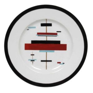
Plate with Suprematist design by Ilya Chashnik, early 1920s
Maria Lebedeva impresses with her jagged telephonist and chiseled secret policemen (in those days, they were heroes). Her friend Alexandra Shchekotikhina-Pototskaya, who designed costumes for Diaghilev, specialised in dancing calligraphy, as well as suns and moons and stars that turned into eyes: her plate ‘Motherhood’ is just ravishing. Among the Suprematists, Vasily Kandinsky and Ilya Chashnik score highly, and Kasimir Malevich turns in an architectonic teapot. First prize? An eight-piece tea set by Nikolai Suetin, complete with clear instructions on how it should be composed on a table.
My only criticism concerns Natalya Danko’s justly famous chess set of Reds vs Whites. Taught by a student of Rodin, Danko did figurines so sensitively, they were sought as far away as Australia. Here, however, upright communists and ghoulish counter-revolutionaries receive little space. It is a poor substitute for that moment when, in a 3D exhibition, you walk round to the front of the White pawns for the first time. Then you realise that they are all in chains. When I saw them in a show once, that literally took my breath away.
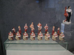
Natalya Danko’s Red and White chess pieces (1922-32)
Revolutionary ceramics gives the lie to the idea that October 1917 turned totalitarian from the word go. Even religious motifs ran riot in those brilliantly-hued early years. For £20, this is an unbeatable challenge to contemporary prejudices and contemporary design standards alike.

@jameswoudhuysen I use my bicycle every day. Exercise and access to shopping without any parking meters and all that fuzz. But alfa-cyclists are the worst. They are competing at 40 mph and always acting rudely to get where they are going.
A PRO-CAR CYCLIST WRITES: 12-1pm tomorrow on #R4, will be talking bikes, cars, pedestrians, public transport – and #JeremyVine
Stimulating piece on the #CrisisOfCustomerService by clever @ClaerB @FT.
All that Clinton-era #CustomerExperience guff was always for the birds - certainly compared with, er, price.
The new thang? Often there is NO service - and thus no #CX!
Innovators I like

Robert Furchgott – discovered that nitric oxide transmits signals within the human body

Barry Marshall – showed that the bacterium Helicobacter pylori is the cause of most peptic ulcers, reversing decades of medical doctrine holding that ulcers were caused by stress, spicy foods, and too much acid

N Joseph Woodland – co-inventor of the barcode

Jocelyn Bell Burnell – she discovered the first radio pulsars

John Tyndall – the man who worked out why the sky was blue

Rosalind Franklin co-discovered the structure of DNA, with Crick and Watson
, a method of quantifying minute amounts of biological substances in the body")
Rosalyn Sussman Yallow – development of radioimmunoassay (RIA), a method of quantifying minute amounts of biological substances in the body

Jonas Salk – discovery and development of the first successful polio vaccine

John Waterlow – discovered that lack of body potassium causes altitude sickness. First experiment: on himself

Werner Forssmann – the first man to insert a catheter into a human heart: his own

Bruce Bayer – scientist with Kodak whose invention of a colour filter array enabled digital imaging sensors to capture colour

Yuri Gagarin – first man in space. My piece of fandom: http://www.spiked-online.com/newsite/article/10421

Sir Godfrey Hounsfield – inventor, with Robert Ledley, of the CAT scanner

Martin Cooper – inventor of the mobile phone

George Devol – 'father of robotics’ who helped to revolutionise carmaking

Thomas Tuohy – Windscale manager who doused the flames of the 1957 fire

Eugene Polley – TV remote controls
0 comments